Data visualisation

FRONT Exhibition

“Plateful Insights” is a collection of six hand built ceramic plates, each a unique narrative about global nutrition. These plates are not mere dining accessories; they are a tactile exploration of data, a physical manifestation of statistics that often remain trapped behind the screens of our digital devices. Each plate represents one of the six regions of the world and is sized according to the difference between the average supply of kilocalories (kcal) of food per person per day and the minimum kcal requirement per person. Their final size reflects the surplus food available to people in each region, providing a visual and tangible commentary on the disparities and abundance in global food distribution. The donut charts break down the percentage of daily kcal intake derived from fats, animal and vegetable proteins, and carbohydrates. This tactile experience encourages a more intimate and reflective interaction with the data, fostering a deeper understanding of global nutrition issues.

Data visualisation

In the battle with addiction, we stand alone

“Plateful Insights” is a collection of six hand built ceramic plates, each a unique narrative about global nutrition. These plates are not mere dining accessories; they are a tactile exploration of data, a physical manifestation of statistics that often remain trapped behind the screens of our digital devices. Each plate represents one of the six regions of the world and is sized according to the difference between the average supply of kilocalories (kcal) of food per person per day and the minimum kcal requirement per person. Their final size reflects the surplus food available to people in each region, providing a visual and tangible commentary on the disparities and abundance in global food distribution. The donut charts break down the percentage of daily kcal intake derived from fats, animal and vegetable proteins, and carbohydrates. This tactile experience encourages a more intimate and reflective interaction with the data, fostering a deeper understanding of global nutrition issues.
Data visualisation

DataVase

“Plateful Insights” is a collection of six hand built ceramic plates, each a unique narrative about global nutrition. These plates are not mere dining accessories; they are a tactile exploration of data, a physical manifestation of statistics that often remain trapped behind the screens of our digital devices. Each plate represents one of the six regions of the world and is sized according to the difference between the average supply of kilocalories (kcal) of food per person per day and the minimum kcal requirement per person. Their final size reflects the surplus food available to people in each region, providing a visual and tangible commentary on the disparities and abundance in global food distribution. The donut charts break down the percentage of daily kcal intake derived from fats, animal and vegetable proteins, and carbohydrates. This tactile experience encourages a more intimate and reflective interaction with the data, fostering a deeper understanding of global nutrition issues.
Data visualisation

Plateful insights

“Plateful Insights” is a collection of six hand built ceramic plates, each a unique narrative about global nutrition. These plates are not mere dining accessories; they are a tactile exploration of data, a physical manifestation of statistics that often remain trapped behind the screens of our digital devices. Each plate represents one of the six regions of the world and is sized according to the difference between the average supply of kilocalories (kcal) of food per person per day and the minimum kcal requirement per person. Their final size reflects the surplus food available to people in each region, providing a visual and tangible commentary on the disparities and abundance in global food distribution. The donut charts break down the percentage of daily kcal intake derived from fats, animal and vegetable proteins, and carbohydrates. This tactile experience encourages a more intimate and reflective interaction with the data, fostering a deeper understanding of global nutrition issues.

Data visualisation

Romania’s donors platform

Client: Code4Romania Year: 2020 Project objective: In 2020, Code for Romania created The Donors Platform with the purpose of ensuring the transparency of data about

Data visualisation

Romania’s Changemaker Map 2022

Client: Ashoka Romania Year: 2022 Project objective: Five years after the first Changemakers Map, Ashoka Romania commissioned in 2022 a new research dedicated to local

Data visualisation

Timișoara Smart City Strategy

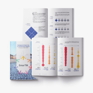
Client: Timișoara City Hall Year: 2022 Project objective: Timișoara City Hall launched a public consultation for its Smart City Strategy and needed to communicate its

Data visualisation

The Morality Stoplight

Client: HBO Romania Year: 2020 Project objective: HBO Romania wanted to promote their new original series about corruption, Tuff Money in a fresh and engaging

Data visualisation

2021: A Year in Happiness

While we all strive for it, happiness is a hard thing to achieve. This was especially true for 2020 which according to the Hedonometer was

Your privacy

This website uses cookies through which information is stored and processed in order to improve your experience. Please read our privacy policy and cookie policy for more information.